Vacation Colors Bring The Happiness Back Home
Maybe you can’t stay on vacation indefinitely, but you can definitely enjoy colors from your favorite getaway even after you get back home. Just incorporate them into your décor!
The idea of surrounding yourself with “vacation colors” comes from Debbie Zimmer, design expert with the Paint Quality Institute, who has employed the technique in her own home. She sees it as a way to extend the afterglow of time spent in a special place.
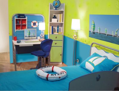
You can extend the afterglow of your vacation by decorating with colors characteristic of your favorite getaway. This room captures the essence of a cool oceanside resort. (PRNewsfoto/Paint Quality Institute)
“Painting a room or two in colors reminiscent of a favorite destination is almost like being on permanent vacation,” she says. “They help you recapture the good vibes you felt while you were away and help you experience them right in the comfort of your own home.”
The color of one’s surroundings has long been known to have strong psychological effect. That’s why so many restaurants are painted red (it increases the appetite) and breakfast rooms are often yellow (it improves our mood). Zimmer’s vacation colors work in somewhat the same way.
We leave our best vacations with fond memories of the places we visit. Adopting colors that – consciously or subconsciously — recall those surroundings brings back positive associations that make us happy, says Zimmer. What more could we ask of color?
If you’re pining for a past vacation place, close your eyes and picture it in your mind. Very likely, certain colors jump out at you:
- Beach vacations are typically characterized by bright blue skies and sparkling blue or green water, with the white of the sand an important accent.
- Memories of mountain trips may recall a wide array of greens ranging from dark shades of jade to lighter tints like mint; or, if your visit was in the fall, rustic reds and burnt orange, interspersed with yellow highlights.
- Travels in desert locales such as the American Southwest may stir up memories of warm earthy colors – from tan to terra cotta, with some sage green or even gray mixed in, often punctuated with bright red or classic turquoise.
Your color recollections may match or deviate from these common impressions. But Zimmer advises that you be true to your personal takeaway from your time away. That’s what you want to replicate in your vacation color scheme at home.
Start with the all-important wall color: The primary hue should be characteristic – even emblematic — of the place you’re channeling, for example, dusky tan for the desert, or bright blue for the beach.
That’s not to say you need to settle on just one paint color for your walls. You can incorporate a second essential hue by painting an accent wall. Or, if you’re lucky enough to have chair rails, you can apply one critical color above the rail and the other below.
Any and all trim in your interior presents more painting possibilities. Secondary shades from your vacation spot can find their way onto everything from baseboards to built-ins (bookcases, shelving, and the like).
If you want to go all in, select furnishings, fabrics, and accent pieces that recall not just the color palette, but also the style of your special place. Although not entirely necessary, this can be some of the best fun of all.
According to Zimmer, what’s important when working with vacation color is to create a space that allows you to experience the good memories of your travel over and over again. “There’s no such thing as too much happiness,” she says, “and vacation color is one way to find and hold onto it.”